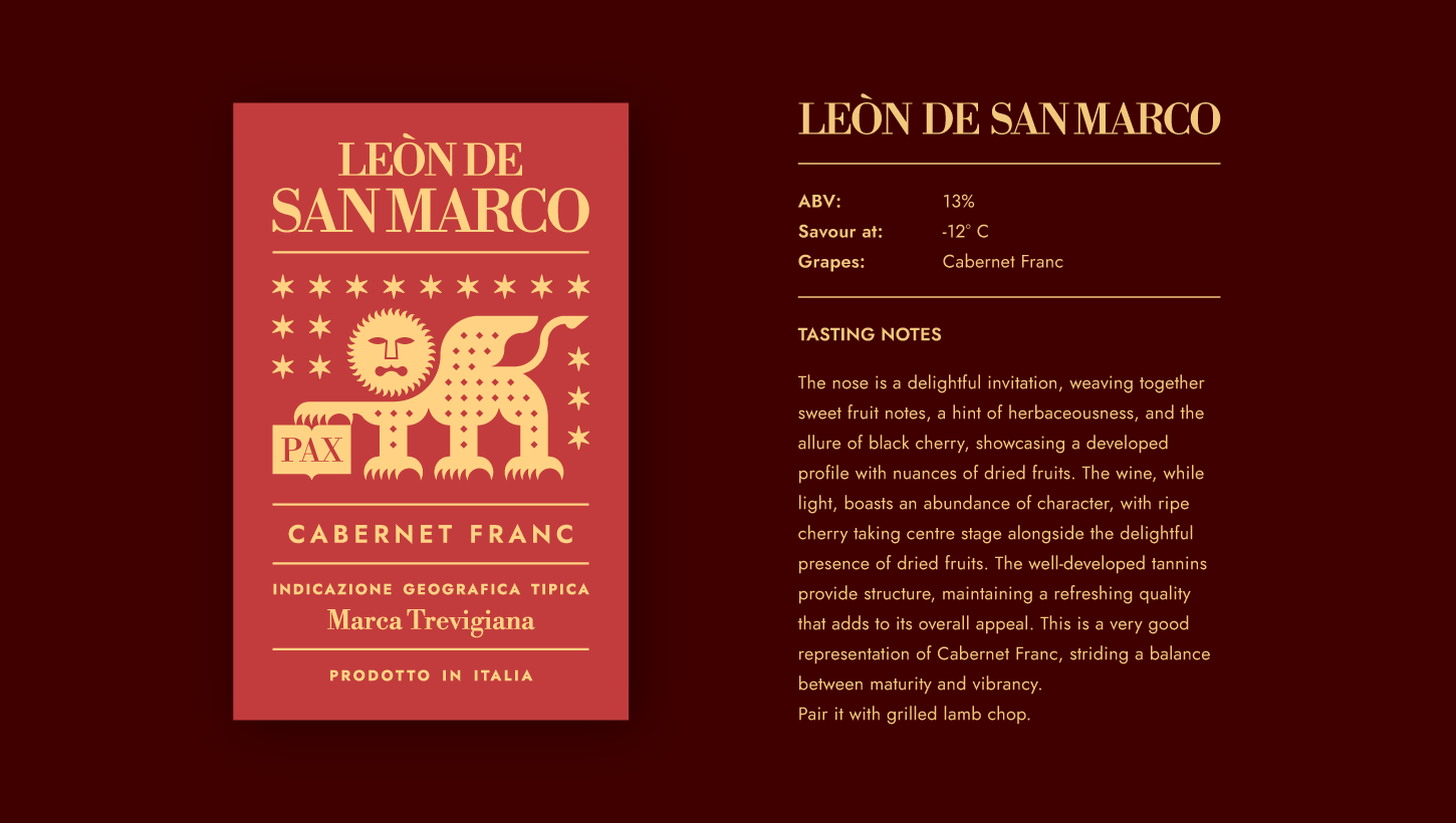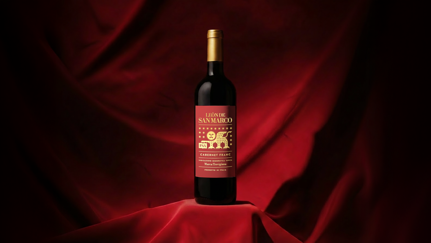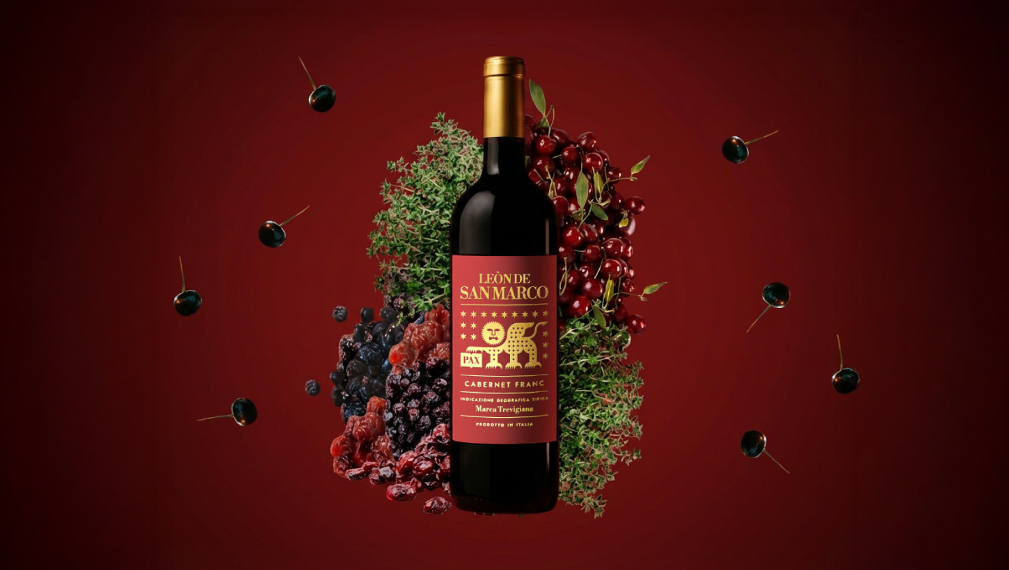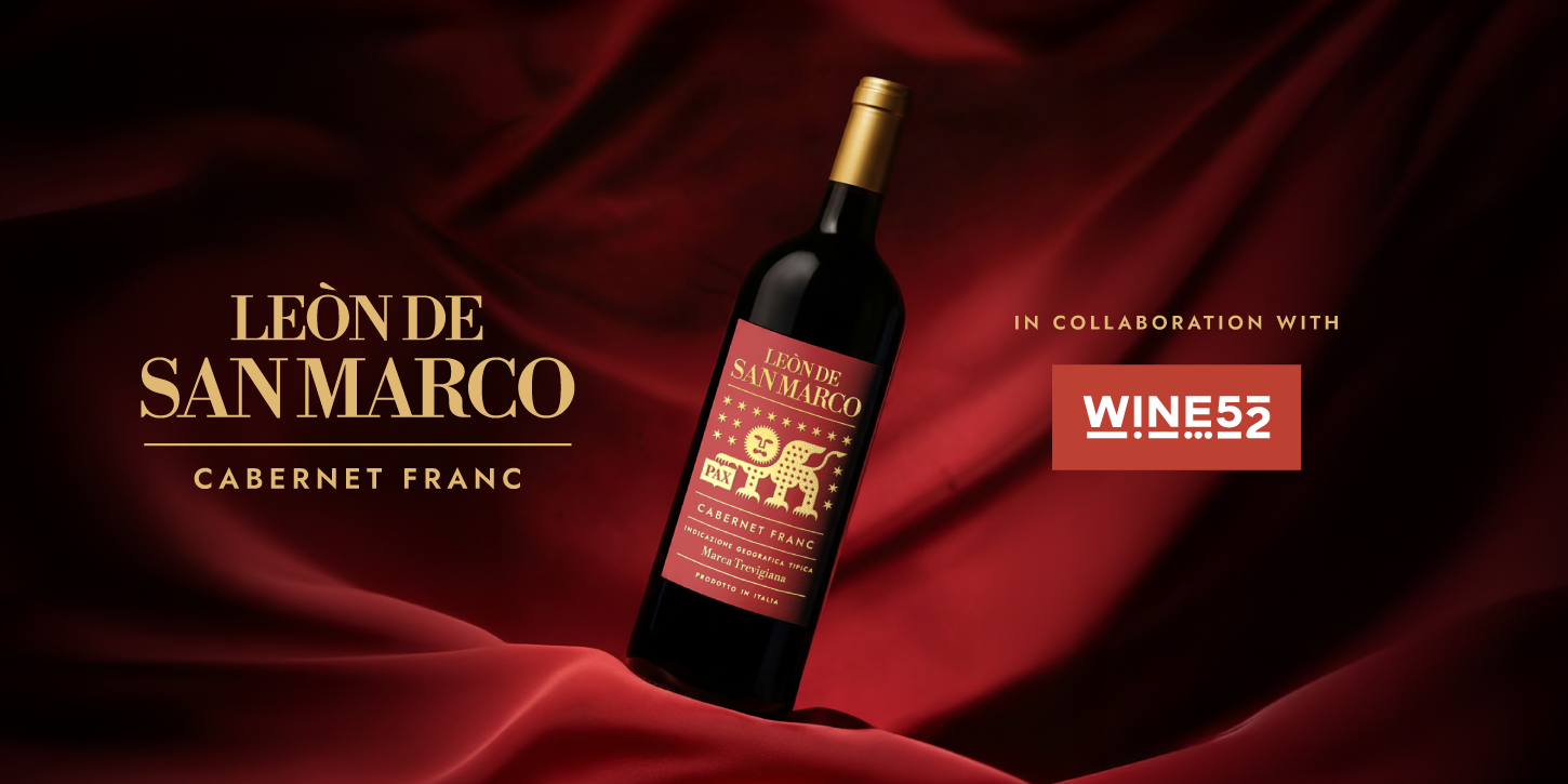
Wine52 commissioned me to create a label design for a Cabernet Franc bottle, with the goal of representing a distinctive theme rooted in the Veneto region.
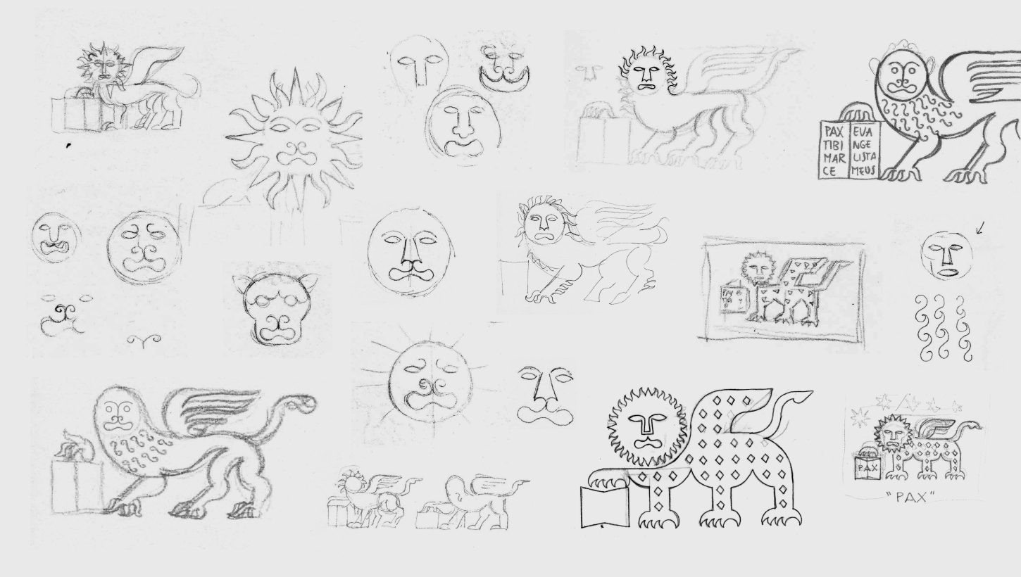
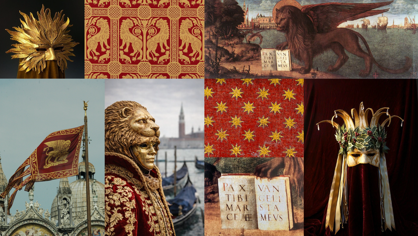
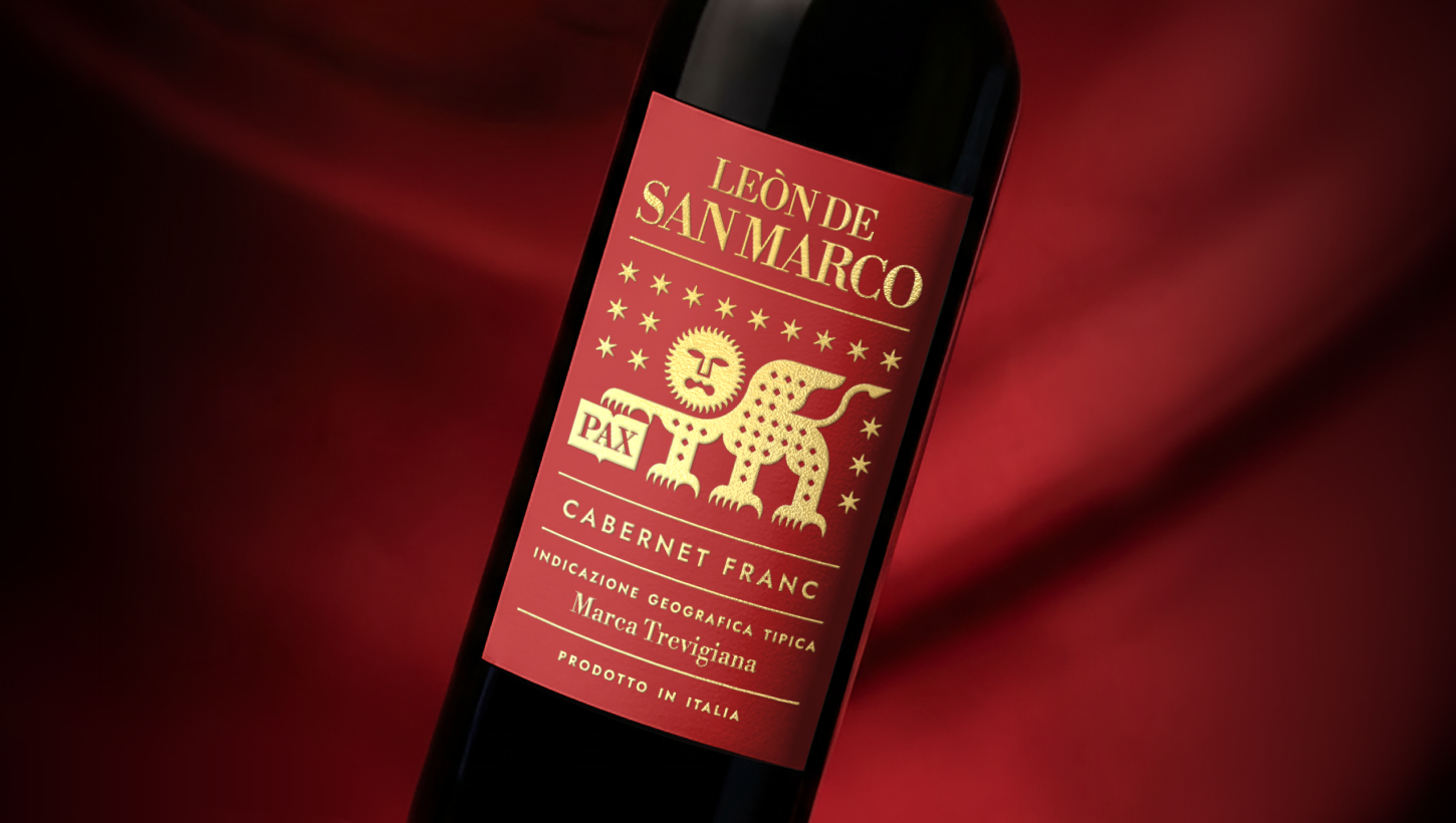
As a passionate expert in heraldic design, my primary source of inspiration was the flag of Veneto, characterized by the iconic Lion of Saint Mark, which became the central figure of the label. The main challenge was to depict it in an original way: within heraldry, the lion is a widely used symbol, so it was essential to give it a strong and distinctive identity.
From a stylistic point of view, I drew inspiration from Byzantine art—an aesthetic deeply connected to the cultural heritage of the Veneto region. The lion’s face, on the other hand, is inspired by the features of a traditional Venetian mask. The fusion of these elements gives the lion a mysterious, magical, and esoteric appearance.
Finally, the wine’s name, “Leòn de San Marco,” draws from the Venetian dialect, adding an extra layer of authenticity, exclusivity, and recognizability to the label.